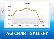
Step 3: View Your Chart
Congratulations! You’ve created your first chart the Right Way. Let’s see what we’ve got:

Now For A Quick Bonus
This side-by-side comparison of these three tech titans is a great example of something else. Sometimes I like to stack the areas a little closer for comparison.
Luckily Right Way Charts allows you to do this naturally, with a simple slider tool.
To get there, use the Edit Areas icon ![]() in your toolbar. This will let you drag your areas to overlap as much or as little as you’d like. Also, under Properties > Chart you can turn off area boundaries for a seamless display.
in your toolbar. This will let you drag your areas to overlap as much or as little as you’d like. Also, under Properties > Chart you can turn off area boundaries for a seamless display.
With under two minutes work (explained step-by-step here) you can make your chart look like this: